Tasquo, a funded SaaS startup currently in development, is building a comprehensive suite of tools designed to simplify scheduling, invoicing, and client management for field service providers.
At this stage in their app development, Tasquo needed help with future planning for scaled growth. This included brand strategy, a logo suite (logo, alternative logos, logomarks, favicon, and color palette.
Logo Design Process
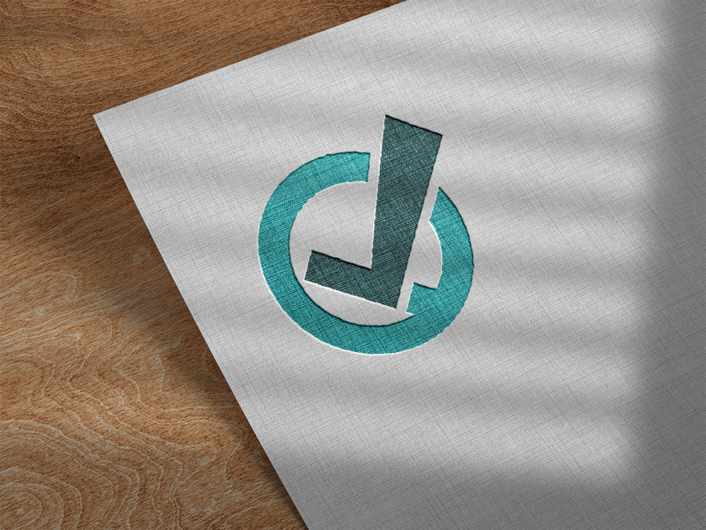
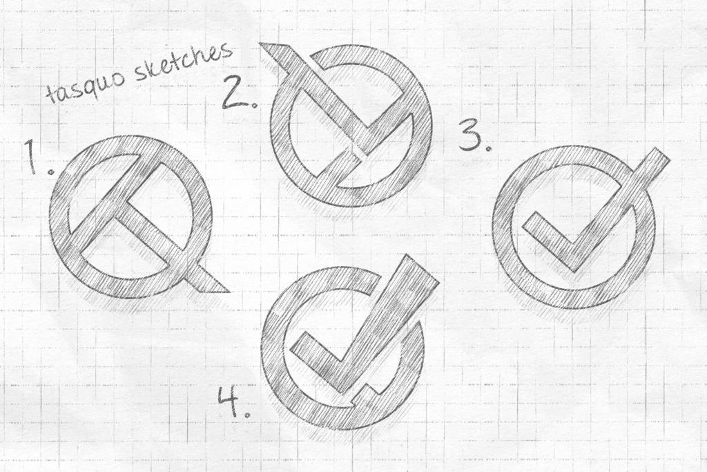
After working through my strategy exercises, we ruled out a more character based logo mark and settled on a stylized T + Q logo to symbolize the “task” + “quote” part of their business name.
- A Q + T combo on its side was promising, but perhaps too ubiquitous.
- As I played with my sketches, I realized we could twist a Q + T logo clockwise to create a checkmark effect, meshing nicely with the task management aspect of Tasquo’s mission.
- I experimented with different checkmark + circle combinations to nail down the proportions.
- I re-drew the T to emphasize a right-facing check and after several tweaks, we had our winner. Tasquo enjoys the emphasis on task completion with the subtle T & Q hidden in the symbol.